
North Vancouver, BC
Creative Design Studio
Portfolio
Every Brand Has a Story to Tell
Every business begins with an idea, but it's the story behind that idea that makes people remember it.
We believe great branding is about more than creating something beautiful. It's about understanding a business, finding what makes it unique, and bringing that to life through thoughtful design and strategy.
Every project in this portfolio has its own journey. From branding and websites to packaging, illustration, corporate presentations, and marketing campaigns, each one was created with a clear purpose: to help businesses connect with people, build trust, and grow with confidence.
Take a look through the work, explore the stories behind each brand, and see how creativity and strategy come together to create lasting impressions.
Because every brand deserves to be remembered.
Selected Work
Explore a selection of projects that reflect our passion for branding, creativity, and purposeful design.
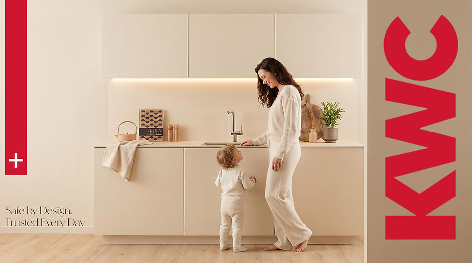
KWC
Social Media Campaigns
Partnered with KWC, a premium international Swiss brand, to develop creative social media advertising campaigns that strengthen brand awareness and engage audiences through compelling visual storytelling. Our approach combined strategic thinking with creative execution to produce impactful ad creatives designed to capture attention and communicate the brand's message across digital platforms.


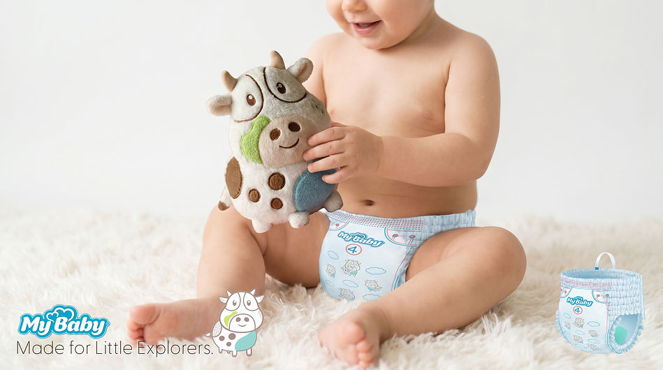
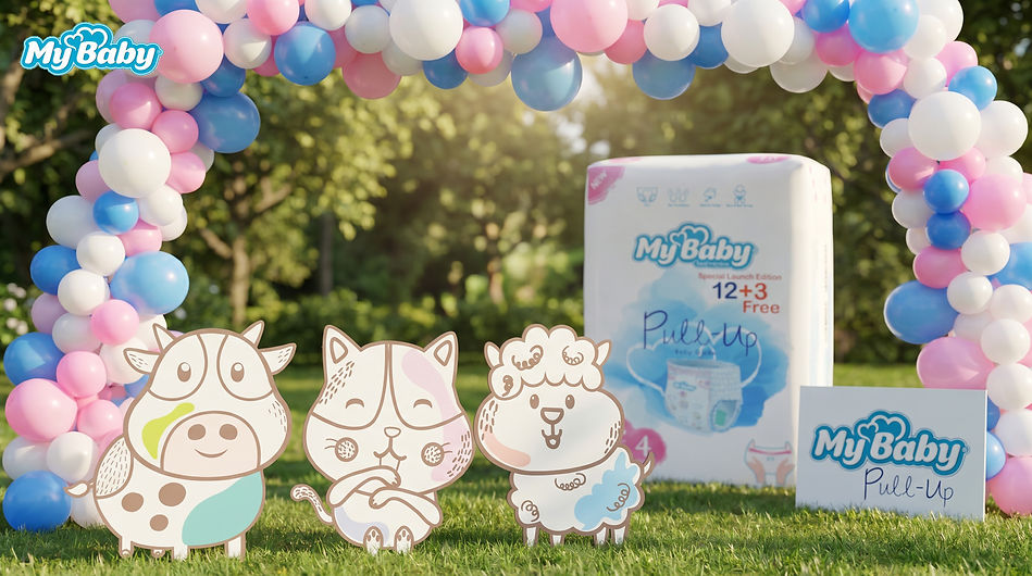
MyBaby
Package & Character Design
Partnered with MyBaby, a leading baby care brand in the Middle East, to create a unique collection of original characters for its Pull Up My Baby diaper range.
Every character was hand-sketched from scratch before being refined into a premium illustration system that reflected the brand's warm, caring, and playful personality. The creative process focused on designing characters that would build an emotional connection with both children and parents while strengthening the product's identity on the shelf.
To ensure the designs truly resonated with the target audience, the concepts were evaluated through focus groups with mothers and children. Their feedback played a key role in selecting the final characters, resulting in illustrations that felt friendly, trustworthy, and memorable.
Using soft color palettes, gentle shapes, and expressive personalities, we created a premium visual language that communicates comfort, care, and joy, helping the brand stand out in a highly competitive market.
a Very Good Pasta Sauce
Package Design
Created a premium packaging design for A Very Good Pasta Sauce, a British Columbia-based brand focused on delivering authentic flavor through a memorable visual experience.
The concept was built around a custom-illustrated pattern inspired by the richness of Italian ingredients, traditional cooking, and the warmth of homemade pasta dishes. The handcrafted illustration style adds personality and creates a unique visual language that helps the product stand out on the shelf.
From the color palette and typography to the detailed pattern design, every element was carefully crafted to communicate quality, authenticity, and the delicious experience behind the brand. The final packaging combines a modern premium feel with a sense of tradition, creating a design that feels both distinctive and inviting.


UNDP & UNIDO
Poster & Brochure Design
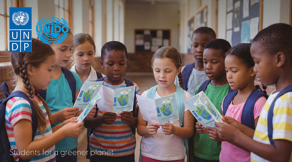
We had the privilege of contributing to the UNDP and UNIDO Green Planet initiative by designing an awareness poster created to inspire children to care for the environment and understand their role in protecting our planet.
The project focused on transforming important sustainability messages into a simple, engaging, and memorable visual experience. Through playful illustrations, thoughtful storytelling, and a child-friendly design approach, we created a poster that made environmental concepts more accessible and inspiring for young audiences.
Our goal was to encourage children to take meaningful steps toward a greener future while showing how design can be a powerful tool for education, awareness, and positive change.
Being part of a project supported by the United Nations was a meaningful opportunity to use creativity beyond aesthetics, to communicate a message that can inspire the next generation.

DADO SENS
Digital Advertising
Healthy, radiant skin inspired the creative direction behind this advertising campaign for Dadosens Skincare. Developed as a third-party creative project, the campaign was designed to communicate the brand’s values of softness, nourishment, and natural beauty through an elegant and emotionally engaging visual story.
The concept transforms the product’s skincare benefits into a premium visual experience. At the centre of the composition, a woman resting on a bed of delicate flower petals represents gentle care, comfort, and the natural softness of healthy skin. The glowing complexion creates a strong focal point, while the floral elements reinforce feelings of purity, freshness, and luxury.
Every visual element—from composition and lighting to colour selection and product presentation, was carefully crafted to create a sense of serenity, elegance, and confidence. The campaign demonstrates how thoughtful art direction and creative advertising can turn a product message into a memorable brand experience.


Danone
Package & Label Design
Created for Light Blue, Danone's bottled water brand in the Middle East, this seasonal label design celebrates the beauty and atmosphere of winter through illustration and storytelling.
The concept was inspired by the sights, wildlife, and everyday moments that make the winter season unique. A custom-illustrated label brings together winter-inspired elements, animals, and seasonal activities to create a playful yet premium visual experience that transforms an everyday product into a memorable limited-edition design.
Every illustration was carefully composed to reflect the freshness and purity of the brand while adding warmth, personality, and a strong seasonal identity. The result is a distinctive label that captures the spirit of winter and creates greater shelf appeal through creative storytelling.


Pupa
Digital Advertising
For this project, we created a series of visually engaging digital advertisements for Pupa Cosmetics, designed to highlight the quality, features, and beauty of the products.
The campaign was developed for a third-party company distributing Pupa products in the Middle East. Because the beauty and cosmetics market in the region is highly competitive, the advertisements needed to be creative, eye-catching, and visually impactful while clearly communicating the key features and benefits of each product.
The design approach focused on bold visuals, premium aesthetics, strong product presentation, and attention-grabbing compositions. Each advertisement was created to capture the audience’s interest quickly and encourage them to explore the products further.
By combining creative visual storytelling with product-focused design, the campaign helped present Pupa Cosmetics as a high-quality, desirable, and memorable beauty brand in a competitive market.


Caffora Cafe
Coffee Brand Identity & Logo Design
Caffora Café is a Japanese-inspired luxury specialty coffee house concept based in British Columbia, Canada. The brand was created to redefine everyday café culture through exceptional coffee, refined hospitality, and immersive customer experiences.
Niwoura Creative Design Studio developed the brand identity, logo design, and creative direction for Caffora Café. The visual identity combines Japanese-inspired simplicity, craftsmanship, precision, and timeless design with a modern luxury aesthetic.
The owl was selected as the central symbol of the Caffora Café logo to represent the brand’s premium 24/7 coffee experience. As a nocturnal symbol, the owl reflects wisdom, awareness, and a welcoming presence at every hour. Its refined and minimalist design creates a memorable visual identity that connects the brand’s all-day café concept with its sophisticated personality.
The branding was designed to position Caffora as The House of Coffee. At this premium destination, guests can enjoy high-quality specialty coffee, explore different beans and flavours, and experience thoughtful hospitality in a refined atmosphere.
This project included café branding, logo design, visual identity development, brand strategy, creative direction, and brand guidelines. The final identity was created to support Caffora’s vision of becoming a distinctive luxury coffee and lifestyle brand in British Columbia and beyond.


Glen Group
Brand Identity & Logo Design
Glen Group is a multi-industry organization based in British Columbia, Canada, with a diverse portfolio of companies operating across different sectors. The goal of this branding project was to create a unified and professional corporate identity that could connect the group’s businesses while allowing each company to maintain its own distinct presence.
Developed a modern brand identity and visual system designed to reflect Glen Group’s growth, connection, strength, and long-term vision.
The Glen Group logo was inspired by the connection between two letter G forms. The interlocking design creates an infinity-inspired symbol, representing continuity, collaboration, growth, and the strong relationships between the companies within the group. The symbol also reflects the idea that Glen Group’s businesses are connected through a shared vision while continuing to evolve and expand.
The visual identity was created with a clean, modern, and flexible design approach. The logo system can be applied consistently across multiple companies, digital platforms, marketing materials, corporate communications, signage, and branded environments.
The project focused on building a cohesive corporate identity that communicates professionalism, trust, innovation, and unity while creating a strong foundation for future growth.


LabelOne | BC Craft Brewers Guild Event
Special Edition Packaging Design
For the BC Craft Brewers Guild event in 2025, Niwoura Creative Design Studio collaborated with LabelOne to create a special-edition can label and illustrated character designs that brought creativity, personality, and storytelling to the packaging.
The objective was to create an eye-catching design experience that would help LabelOne stand out at the event booth and capture the attention of visitors. Through custom illustrations, unique characters, and engaging packaging design, the project transformed a simple can label into a memorable brand touchpoint.
Niwoura also developed supporting social media content to promote the event and strengthen audience engagement, ensuring a consistent visual identity across both physical and digital platforms.
The final result was a cohesive event branding experience that combined packaging design, illustration, and digital marketing to enhance brand visibility and create a stronger connection with the audience.

